
Are your spreadsheets still serving you well, or is it time to make the move into new technologies and the use of FM software?
You know the score, it’s late on Friday and there’s a pool of water collecting by the central heating boiler in the East Building. Who to call? When was it last inspected? You know you can’t leave it over the weekend.
It really is the perennial problem. Assets widely distributed across your buildings, with so much that could and sometimes does go wrong.
So, maybe there’s a bunch of spreadsheets you can consult that catalogue each building, an equipment list, compliance schedules and who is responsible for maintaining each asset.
Over recent years, things have improved, but it still feels like many are working in the dark.
A survey of facilities managers reported that 67% of UK estates with 6-10 buildings and 55% with 11-100 buildings do not use a software solution to manage their data.
And if you’ve relatively few buildings to manage from a compliance and maintenance perspective, a spreadsheet might seem like a good choice for low data volumes, minimal direct costs and simple reporting needs. But in our experience, this is so often a false economy, as this manual approach is fraught with potential pitfalls.
How easy is it to move from spreadsheets to FM software?
Easier than you might think.
In the example to the right asset data has been loaded from a spreadsheet and transformed onto a floor plan. This visualisation makes it much easier to see where assets are located and the contents of each room or space.
The same principle applies to other types of information such as that needed for compliance purposes or reactive maintenance/service desk data or even contracts and leases.
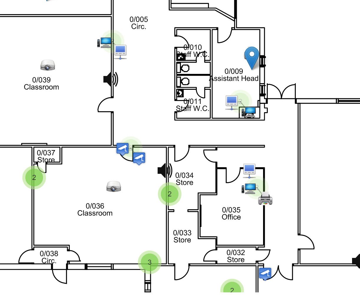
Visualising data really helps in understanding what is where, and this is especially helpful in describing issues to other interested parties such as off-site contractors.
Overall, this valuable insight improves day-to-day administration and helps with prioritisation and reporting.
Different types of data can be represented using icons. This provides a unique at-a-glance understanding. In the image to the right, the top two markers represent gas connection points; a blue marker in the middle represents a water connection and the two red markers are outstanding maintenance jobs.
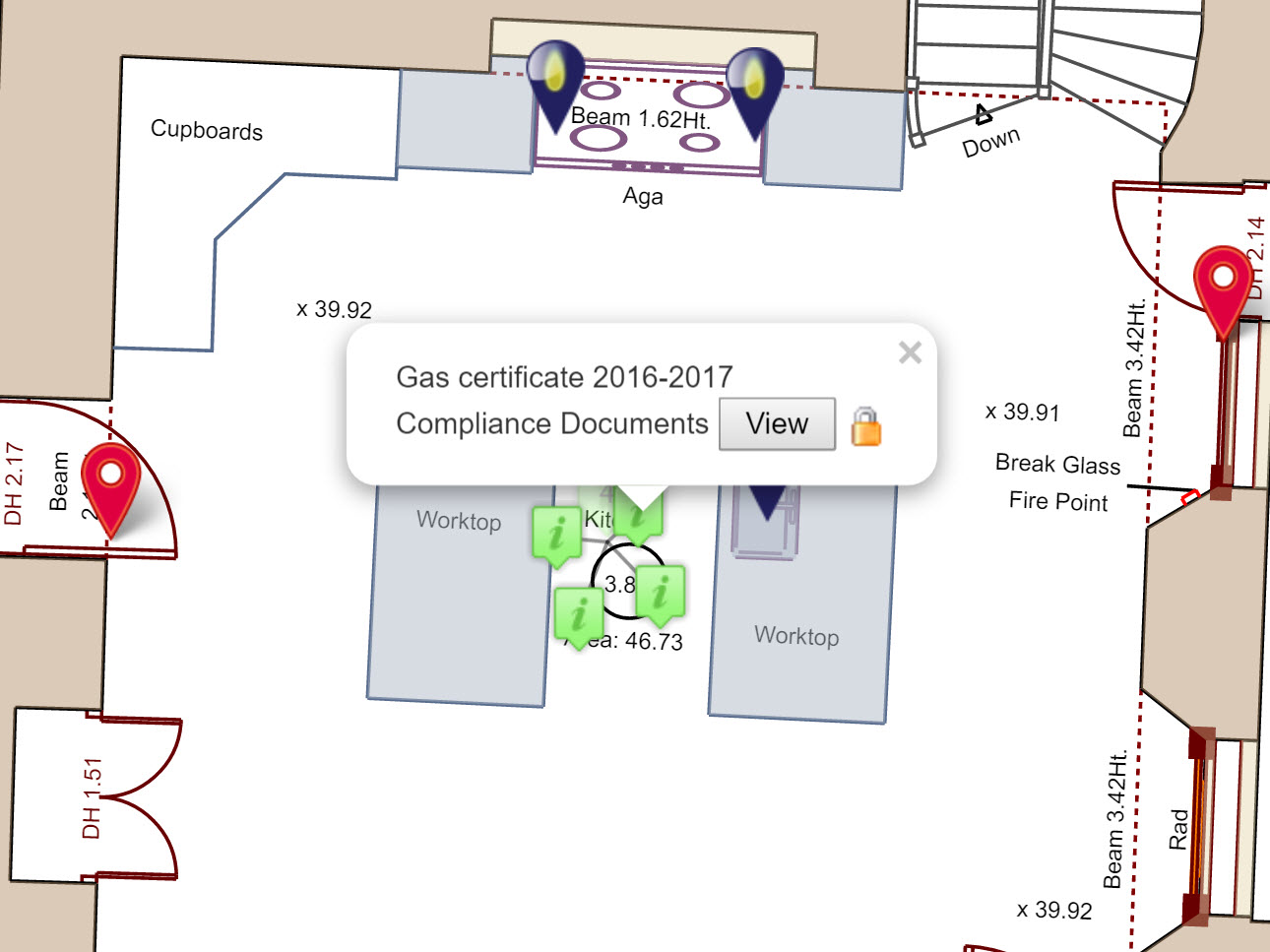
As the jobs progress through different stages to completion the markers change colour, so it’s possible to immediately see which ones haven’t been dealt with and which ones are in progress.
From bird’s eye to 360-degree views
There’s nothing better than being onsite to understand the location and circumstances of a problem or asset, but often that’s not possible or even desirable from a time, cost and sustainability point-of-view.
Managing your data on a site or floor plan gives you a comprehensive bird’s eye view of where data is located. Taking this further and integrating plans with 360-degree images of rooms or spaces provides an invaluable view of your asset or job information is it appears in the right place on the right asset.
Identifying asset or maintenance information in 360-degrees makes it clear which asset is being discussed or which one has a problem. No more contractor visits where, as has happened, the wrong light is ‘fixed’ or a perfectly working door lock is replaced by mistake!
As building and estates become ever more complicated and the responsibility of keeping assets and systems running smoothly often more fragmented, the humble spreadsheet really has had its day.
Technology can sometimes become an expensive hindrance, yet in the FM CAFM software examples shown above, it really is the best friend of anyone with the responsibility for managing and maintaining often complex buildings and estates.
Read more about how AltoSites helps you manage your buildings and estates