Sometimes it can feel like you’re trying to peer through the shutters around your data to gain insights into your information, especially when all your data is contained on spreadsheets. Using spreadsheet data for CAFM does work but some FMs reach a point where their organisational and reporting needs mean they require a different approach.
If you have relatively few buildings to manage from a compliance and maintenance perspective a spreadsheet is a good choice for low data volumes; minimal direct costs and simple reporting needs.
However, you might be using a spreadsheet by necessity because you think a software product will be too complex for your needs or will be too expensive. In this situation you might compromise by accepting limitations in terms of accessing and updating data by more than one person or the additional costs from having to re-purpose data for reporting needs.
Transforming spreadsheet data to improve access
What if you could take your spreadsheet data and simply, easily and cost-effectively manage it in a more visual and intuitive way on site and/or floor plans?
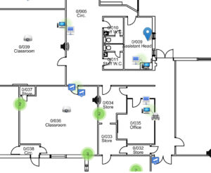
 In the plan above asset data has been loaded from a spreadsheet and automatically positioned onto a floor plan. This visualisation makes it much easier to see where assets are located and the contents of each room. The same principle applies to other types of information such as that for compliance purposes or reactive maintenance/service desk data or even contracts and leases.
Visualisation paints a picture of your data helping you immediately and visually see:
- What assets or facilities data you have;
- Where it’s located and,
- Where relevant its status.
This valuable insight improves day-to-day administration and helps with prioritisation and reporting.
Different types of data can be intuitively represented using different icons. This provides you with unique at-a-glance understanding.
In the image below the top two markers represent gas connection points; a blue marker in the middle represents a water connection and the two red markers are outstanding jobs.
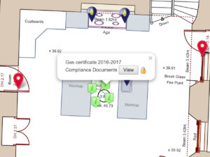
These change colour as they progress through different stages to completion so you can immediately see which jobs haven’t been dealt with and which ones are in progress.
From Bird’s Eye to 360 degree views
You now have an intuitive ‘bird’s eye’ view of your data. Why not take it a step further and manage it in a 360 degree room based view as well as on a plan as shown in the video below.
Using these features it becomes much easier for you to find, understand and update data. With plan based views and 360 degree views communication and collaboration between staff and stakeholders is made significantly easier in the office and on-site.
Technological developments such as these make it an exciting time to be looking after buildings and estates! So if you’re reaching a point where using spreadsheet data for CAFM is becoming onerous there is a natural progression available to you.